18 thoughts on “Proposed Book Covers – Looking For Input”
I like the second on better since the first one kinda hurts my eyes because of all the bright colors but, I do like the design of it. I also think that the second one is more….. professional looking? I like them both but, my preference is the second one.
Both are nice, but I think the first option is brighter, more catchy and will sell better. I also like the design with the film passing through the numbers. However, as SteinHOF16 mentions, the title may not be immediately obvious – the design could perhaps be adjusted to fix this. Second option is softer on the eye but the UMR logo is too large, which could cause it to get confused with the title. Good luck either way 🙂
They both look good. The orange one is more eye-catching but at first glance the 50 kind of looks like a 60. The dark one looks more ‘serious’ but it has a variety of colors, the first might be too orangey. I think the addition of still photos of famous movie stars in the boxes on the dark one might make it more attractive.
Hey Steve…as always thanks for the visit and the comment. Good point about the 50 being a little too hard to read. I am so mixed in my feelings….I like the color of cover 2 more, but like the design of cover 1 more, and like the title of cover 2 more. Luckily…..our book designer,Authentic DNA Studio LLC, is willing to listen to suggestions. I think the still photos would look good…..just worried about copyright issues. Working on that issue. Good feedback as always.
Bruce, copyright for old movie star photos might be an issue, you can try ‘creative commons’. I think all they want is appropriate credit for each photo used, usually at the end of a book. Wikipedia claim to have over 6 million public domain images in their library. But best to read the small print just in case. 😉
I prefer option 2, the dark background 1 as i think (a) it is more luxurious looking and (b) it conjures up for me the image of sitting in a darkened cinema.
You will of course hopefully have at the rear of the cover a brief description of your own passionate links with movies and the history of your site, and it’s always worthwhile to not “hide your light under a bushel”. You have won much well deserved praise for your great work on UMR over the years and have received many quotes from your viewers in that respect. I always like to have a flavour of other people’s opinions – though not Joel’s! – when I am deciding on whether to buy a book, so I would want to see, if just on the a flyleaf one or two expressions of appreciation from viewers. A Brando book of mine for example has a flattering fly leaf quote from George C Scott and a couple of other legends.
Hey Bob. Another one for the UMR colors book cover. I like the image of sitting in a darkened cinema. Yep the back of the book cover will have a description of the book. Currently the book is 293 pages…..and that does not include the index page….I am getting excited about it. I appreciate the kind words about our website…..it has been a fun ride. Good information on the books you like to buy and what you like to see. Good feedback.
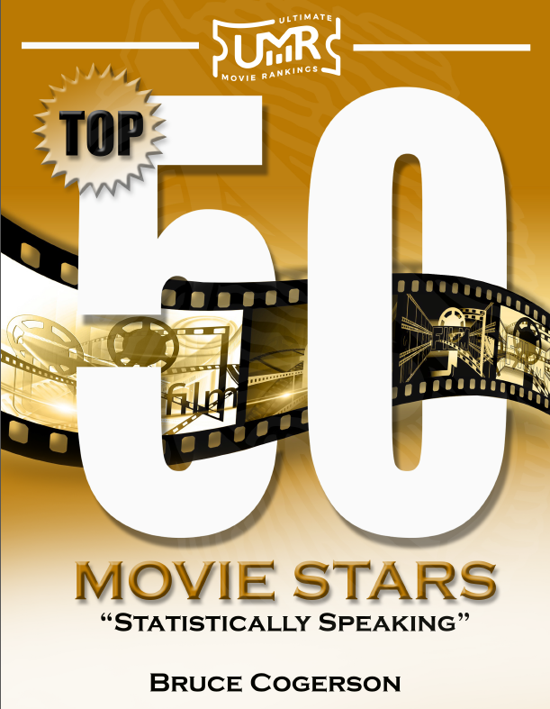
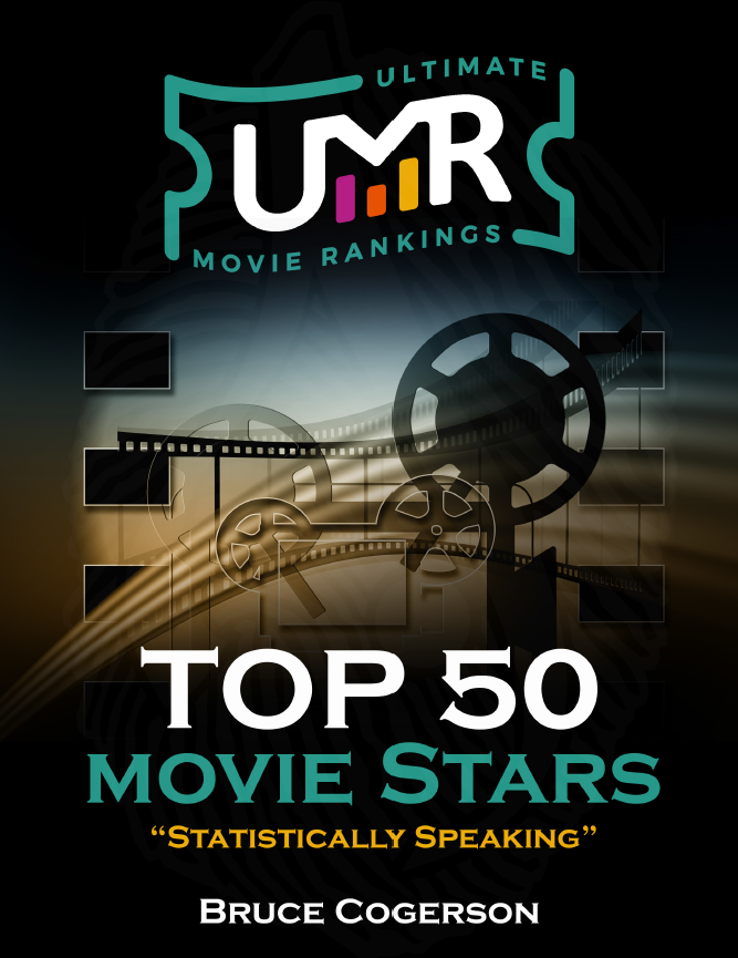
I like the second on better since the first one kinda hurts my eyes because of all the bright colors but, I do like the design of it. I also think that the second one is more….. professional looking? I like them both but, my preference is the second one.
Both are nice, but I think the first option is brighter, more catchy and will sell better. I also like the design with the film passing through the numbers. However, as SteinHOF16 mentions, the title may not be immediately obvious – the design could perhaps be adjusted to fix this. Second option is softer on the eye but the UMR logo is too large, which could cause it to get confused with the title. Good luck either way 🙂
They both look good. The orange one is more eye-catching but at first glance the 50 kind of looks like a 60. The dark one looks more ‘serious’ but it has a variety of colors, the first might be too orangey. I think the addition of still photos of famous movie stars in the boxes on the dark one might make it more attractive.
Hey Steve…as always thanks for the visit and the comment. Good point about the 50 being a little too hard to read. I am so mixed in my feelings….I like the color of cover 2 more, but like the design of cover 1 more, and like the title of cover 2 more. Luckily…..our book designer,Authentic DNA Studio LLC, is willing to listen to suggestions. I think the still photos would look good…..just worried about copyright issues. Working on that issue. Good feedback as always.
Bruce, copyright for old movie star photos might be an issue, you can try ‘creative commons’. I think all they want is appropriate credit for each photo used, usually at the end of a book. Wikipedia claim to have over 6 million public domain images in their library. But best to read the small print just in case. 😉
https://commons.wikimedia.org/wiki/Cary_Grant
Hey Steve….thanks for the link…..getting ready to add photos to the book….and that link will be helpful.
HI BRUCE
I prefer option 2, the dark background 1 as i think (a) it is more luxurious looking and (b) it conjures up for me the image of sitting in a darkened cinema.
You will of course hopefully have at the rear of the cover a brief description of your own passionate links with movies and the history of your site, and it’s always worthwhile to not “hide your light under a bushel”. You have won much well deserved praise for your great work on UMR over the years and have received many quotes from your viewers in that respect. I always like to have a flavour of other people’s opinions – though not Joel’s! – when I am deciding on whether to buy a book, so I would want to see, if just on the a flyleaf one or two expressions of appreciation from viewers. A Brando book of mine for example has a flattering fly leaf quote from George C Scott and a couple of other legends.
Hey Bob. Another one for the UMR colors book cover. I like the image of sitting in a darkened cinema. Yep the back of the book cover will have a description of the book. Currently the book is 293 pages…..and that does not include the index page….I am getting excited about it. I appreciate the kind words about our website…..it has been a fun ride. Good information on the books you like to buy and what you like to see. Good feedback.